You can’t judge a book by its cover. Except… you can. More importantly, we do.
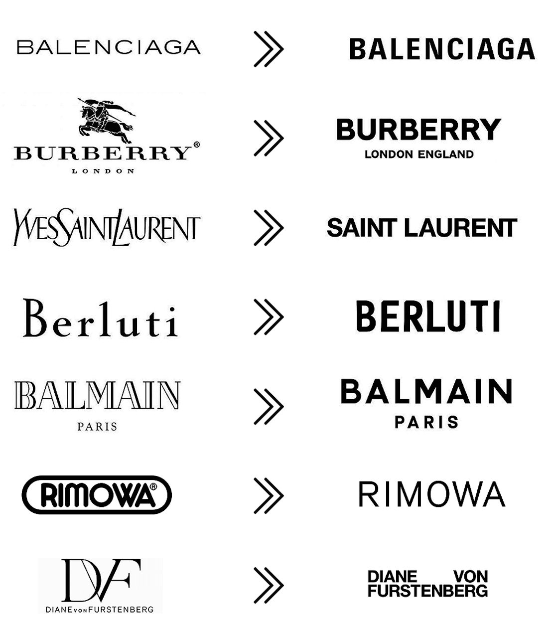
That’s why it was so concerning circa 2018 when nearly every major fashion brand—from Burberry to Yves Saint Laurent—went sans serif.
What they gained in appealing to a younger Gen Z audience of online shoppers whose global taste transcends traditional fashion culture, they lost by disrupting their own singularity. They undid arguably the most important hallmark of identity and heritage relevant to their standing in the market and in the minds of fashion connoisseurs: the way their name appears.
This is not a problem for startups, whose goal is to establish a place among the existing pantheon. They need only seek to define themselves in the shifting cosmos and strive for their fashion to gain its due.
Whereas an established brand must navigate the tastes of new generations while not alienating their existing clientele. They must adopt to new media channels and become friendly to shopping in these spaces while, again, maintaining the traits that have carved out their share.
Briefly for context, there are two general categories of typefaces. Serif and San-Serif. Serifs are those darling little “tail” or extending feature at the ends of a letter stroke.
Of course there are equally consequential variants to fonts: height and thickness of the letters, spacing, and the character of how the letters are designed.

Coca-Cola learned a hard lesson in 1985 when it introduced a new formula and deviated from their iconic cursive font to a banal-looking typeface and the one-word name Coke. A failure to appreciate their singularity—what makes them absolutely unique—that allowed Pepsi to gain ground in the market.
While certain brands—Gucci, for one—have made the conversion to sans-serif without losing a stride, we won’t necessarily know the ultimate effects of the shift for a few more years. Established clientele will continue going to their go-to brands for the fashions they desire. But what happens when the next new generation arrives and surveys the landscape of luxury fashion brands.
Will they recognize any difference between Balmain and Balenciaga? Or Burberry and Balmain? Might they mistake YSL for LV?
Luxury brands with a rich history some hundred years old may believe their roots are so deep that their standing is unshakeable. Yet they have the most to lose by adopting a typeface that any startup could apply to their own name in one click. Or tap. Or however art directors of the future will apply software.
It is often by more subtle evolutions that brand makes a successful pivot—or series of tweaks—to attain their best fit in terms of positioning while keeping fully intact their identity and history.
Every brand is telling a story, and they all begin with the presentation of their name.
